Improve Squarespace website designs by learning from Karl Gerstner (part two)
Swiss artist and typographer Karl Gerstner and his designs can teach us a great deal about improving our Squarespace website designs.
In this second article, I discuss Karl Gerstner’s work and how he used grids to create consistent yet creative layouts. I talk about how he inspired the “Gerstner” Premium Squarespace template.
Inspired by Karl Gerstner
Studying a designer’s work in another medium and applying it to the web can be a great way to learn. Gerstner’s grid allowed him to arrange content on Capital’s pages rapidly and in a structured manner. It was flexible and allowed him to be creative when laying out his pages. It helped him solve design problems without dictating the final result.

Capital magazine design by Karl Gerstner
Gerstner took advantage of the modular nature of his grid to create an unusual layout for this spread for Capital. Although the two pages look very different, they share a common foundation, and if you look closely, you’ll notice how the visual weight of the large image on the left is balanced by the text columns on the right.

Six column modular grid
I used six columns from Gerstner’s grid—which should be pretty familiar if you’re used to twelve columns.

Wireframe illustrates the structure
I blocked out the position of my images and text to help me decide their placement and proportions. This wireframe illustrates the structure, which will be helpful while designing *and* developing a design like this with HTML and CSS.

Composition could work for editorial or online store
Although the grid is symmetrical, the contrast between the large and small images creates tension, which prevents the layout from feeling static. This composition could work equally well for an editorial design or an online store page.
Capital magazine design by Karl Gerstner
Flexible grids
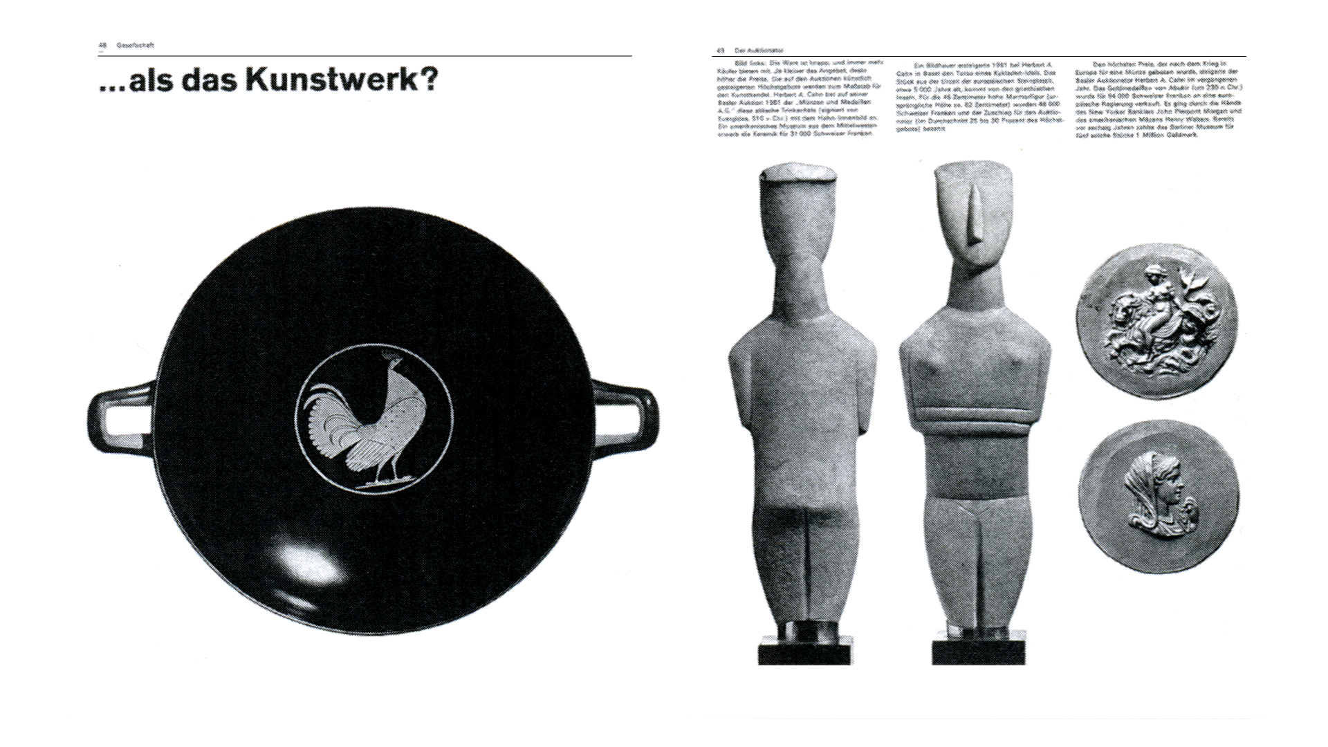
Flexible grids like this help us creatively arrange elements within a composition without dictating the final result. Even with the same underlying structure, results can look entirely different.
I really enjoy how Gerstner used the height of the two tall figurines, which span multiple rows, to balance the pottery item to their left. I also like how the small coins slot neatly into modules, with their position and size defined by the grid.

Wireframe illustrates the structure
A wireframe illustrates the structure of the composition, which is incredibly versatile and can be adapted to many types of content.

Incredibly versatile composition
Gerstner’s grid is good for enabling designs with plenty of whitespace and for organising pages packed with content.

Capital magazine design by Karl Gerstner
This design for Capital contains multiple images and text blocks, which he arranged in a way that exposes his grid. My designs often need to accommodate several images and text in a limited space. To remain readable, those elements must be well-organised and have a noticeable hierarchy.

Wireframe illustrates the structure
My wireframe informs the shape and size of the largest image, which becomes the focal point of this design. The smaller images and text blocks flow around it and remain connected by the grid.

Large image becomes the focal point of this design
This visual connection can be critical to communicate that elements within a design are also connected meaningfully.

Capital magazine design by Karl Gerstner
In this example from Capital, the images storyboard a narrative, and their placement reminds me of a comic book layout.

Portrait photos in a formal group
The story I’m telling in this next Gerstner-inspired design is that the team members have a close relationship. So, I arranged their portrait photos in a formal group on one side of the page. But, sometimes, I might want a looser-looking layout to suggest a less formal arrangement—something that Gerstner achieved with this final design.

A less formal arrangement
It’s important to remember that grids should inform, not dictate, aspects of a design. This was one of the fundamental principles of Gerstner’s grid design. Shifting elements inside the grid, pulling them out of their grid lines, and arranging them so the eye flows across them all make a design feel less formal, looser, and more energetic.

Premium Squarespace templates
“Gerstner” is a premium website template designed for Squarespace 7.1. It combines classic layouts with a contemporary aesthetic and includes pages and custom elements to create an inspirational website design that will stand out from the crowd.
Developed with Squarespace Fluid Engine to be fully responsive and look fabulous on any device, every template includes over a dozen pages: home, about, blog, contact, services, team, testimonials, videos, a choice of 404 pages, and inspiring multi-purpose page layouts. They can be easily customised with colours and typefaces to match your brand.
We limit each Stuff & Nonsense Squarespace template to only 250 installations to help our customers’ websites look distinctively different. Whereas Squarespace free templates have been used thousands of times on countless websites, the number of websites using Stuff & Nonsense Squarespace templates will always be limited, helping them stand out.
You can find out more about how learning from Karl Gerstner can improve your Squarespace website design in part two.